reimagining the movies
welcome to the theater of the future
Role
primary research
ideation
UI Design
fabrication
tools
figma
adobe illustrator
lots of styrofoam
team
kevin petrovic
timeline
sep 2018 - dec 2018
(12 weeks)
results
concept presentation
mobile app prototype
physical chair prototype
For my first taste of human-centered design, I reimagined and designed for the ideal future of the movie theater experience.
This project was for ‘The Human Factor in Innovation and Design Strategy’, a design class at MIT. After initially conducting our primary research together, my team separately formulated solutions to the problems that we observed, and came together to refine our ideas into final deliverables.
Our design process began with learning and applying the importance of empathy - getting to know our target audience through close observation and understanding - and culminated in a final review in front of a panel of design professionals. Our design solution focused on overcoming the pain points of the movie theater industry by completely disrupting the idea of a traditional experience at the theater, including the planning phase, the physical arrangement of seats, and the post-movie exit experience.
View a demonstration of the app concept Pikflik here, or our presentation materials here.
final design
In the theater of the future, you’ll be able to take advantage of apps like PikFlik, which streamline planning for your large group of friends without fuss. When you arrive, completely modular seats let you sit however you like. At the end of the show, satisfy your inner fan by taking exclusive collectibles home with you.
features
plan
Invite friends to your movie plan, and together decide on the time range and distance you’re willing to travel.
PikFlik generates all movies showing that fits your parameters. The group votes on all of the movies to decide.
Preselect seating and order concessions before you arrive.
connect
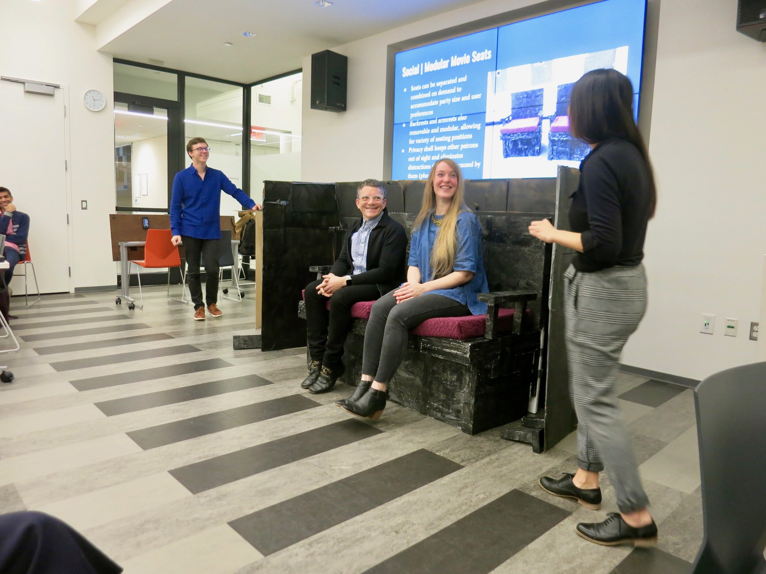
Modular seating provides a unique opportunity to connect with the group you want to experience the movie with.
Configure seats exactly to your liking, with easily removable parts (like arms and backs).
Recreate a homey living room in the movie theater.
remember
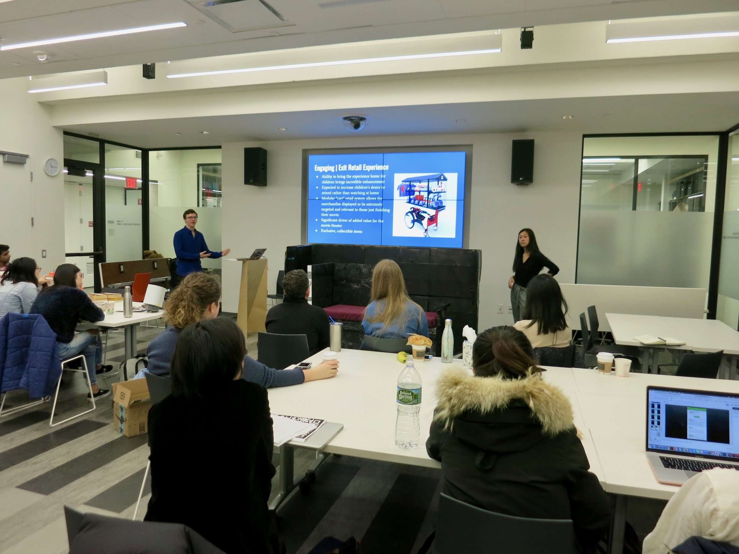
Make the movies truly unforgettable by taking a keepsake home with you.
These unique, collectible momentos are only available when you see the movie in theaters.
background
problem
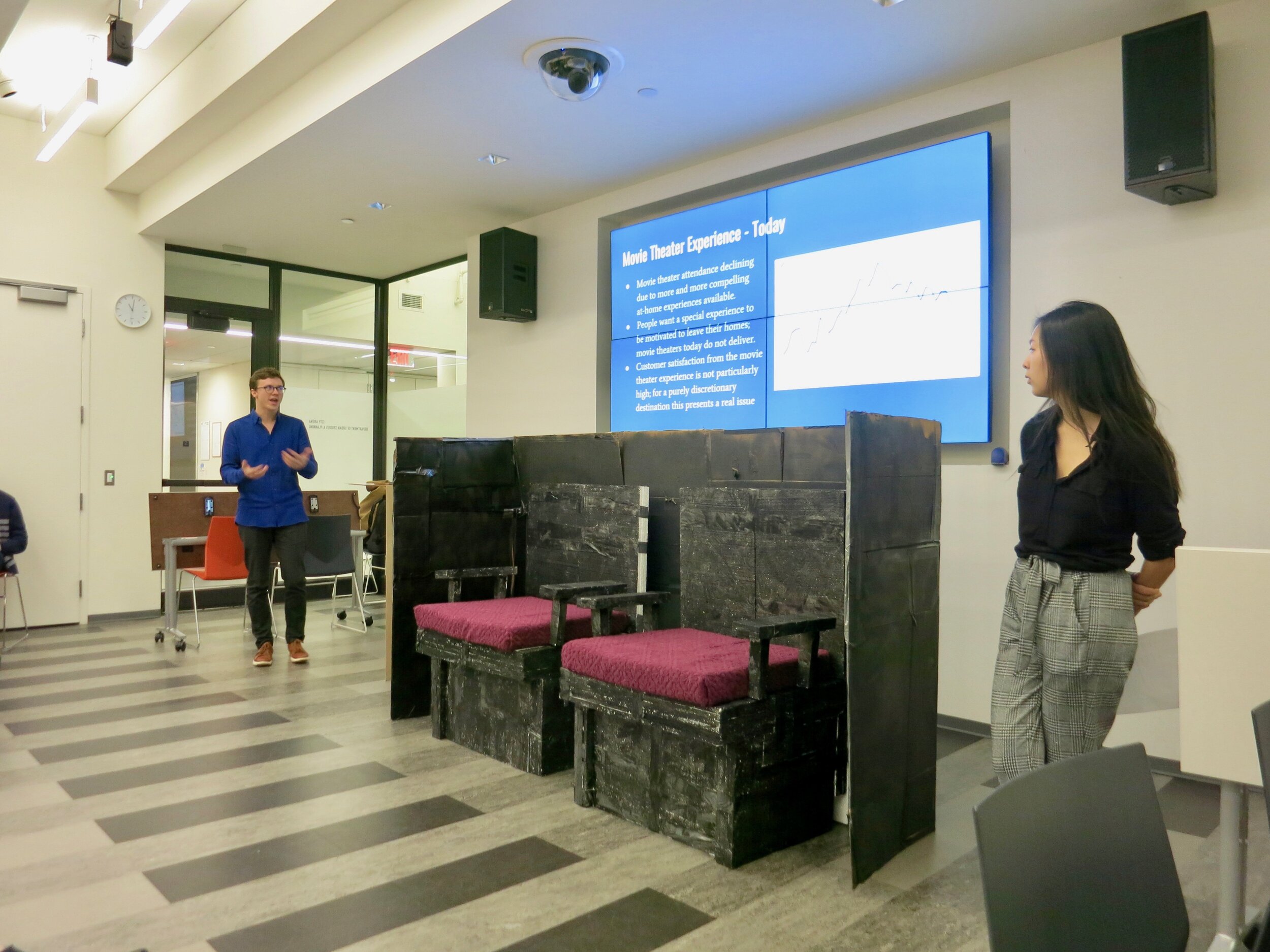
Due to factors like online streaming, fancier technology such as surround sound speakers and large flatscreens, and the rising price of tickets, movie theater attendance is declining because more compelling at-home experiences are available to a large population.
People want a special experience to be motivated to leave their homes, which movie theaters today do not deliver. Many would much rather save a few dollars by waiting a few months for the movie to be available on streaming platforms and watched in the comfort of their homes. To compete, movie theaters need to be able to offer a totally unique experience, especially for the price they charge.
opportunity
How might we reimagine the moviegoer’s theater experience to be spontaneous, social and engaging?
observational research
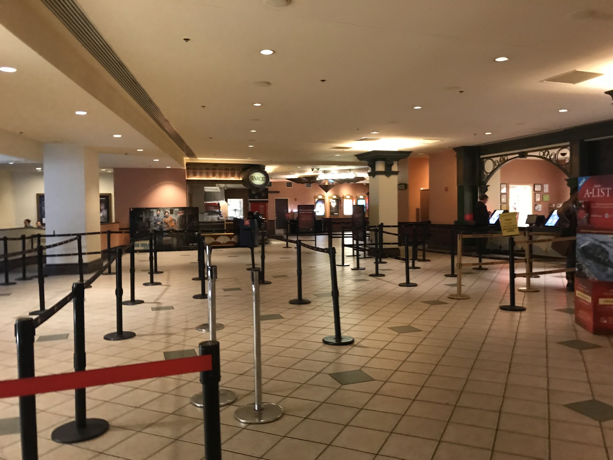
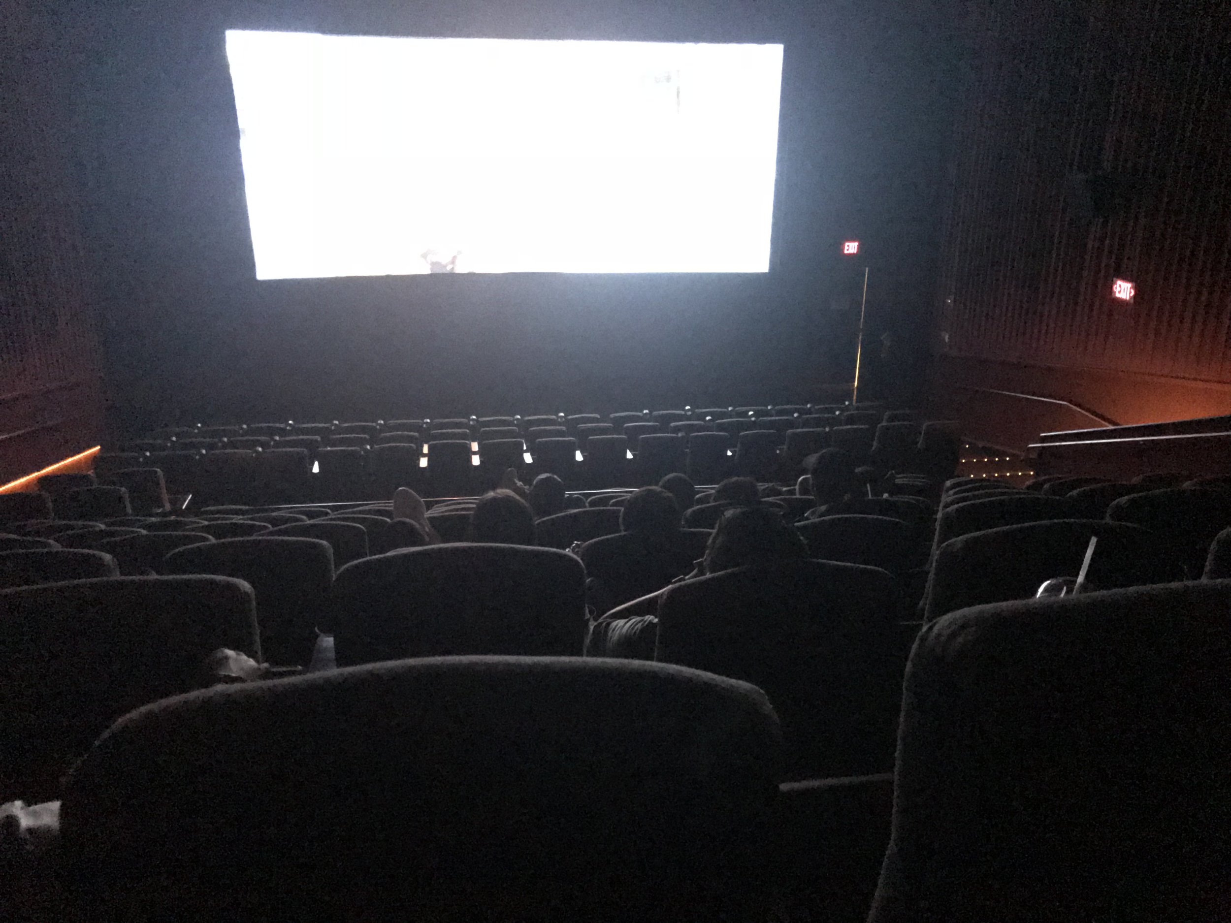
After we chose the service experience we wanted to explore, Kevin and I took some time to go see a movie. From entering the theater to leaving after the movie ended, we carefully observed aspects of the process and our own feelings throughout through notes and pictures.
It was helpful that each of us had a completely different perspective and upbringing on trips to the movies. I am an avid movie-goer who grew up seeing movies with my entire family - as a young adult now, I probably see at least one movie a month. On the other hand, Kevin didn’t see movies often, and his last trip was several years prior to our research. This way, we each had very different mindsets, and consequently, very different observations and standout moments. It was fascinating to see him make his way through a process so familiar to me. He had never even used the butter dispenser to add extra butter to the popcorn!
Some of the key shortcomings that we observed included:
Extreme difficulty choosing a movie with a group; but a sense of awkwardness or stigma towards going alone.
Apathy towards going out vs. staying in - lack of elements to make the experience memorable or special.
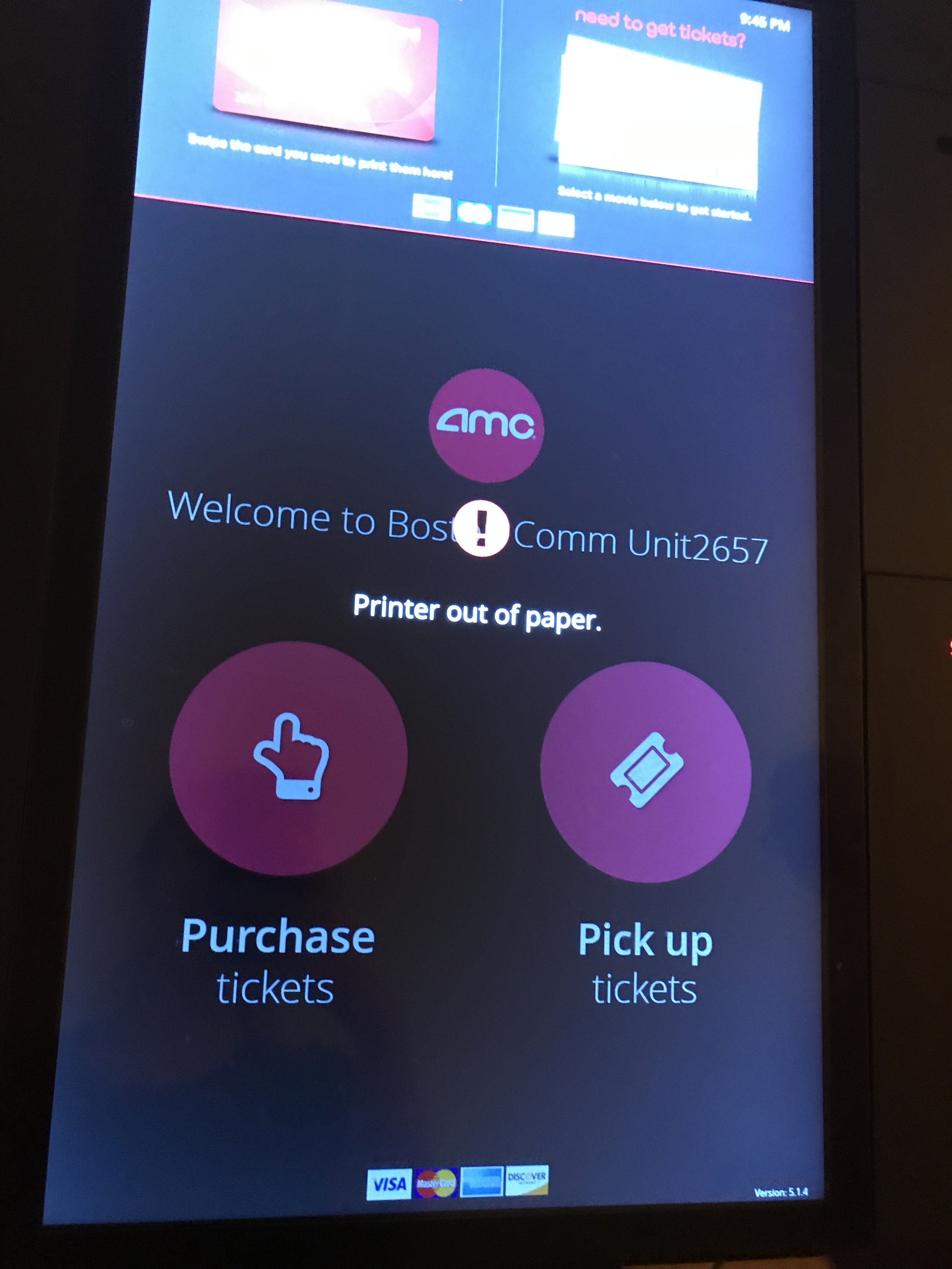
Queue time for tickets is greatly variable; self service functionality not complete (with broken machines).
Outdated decor, often not particularly inviting.
Overpriced food relative to quality and service experience. No ability to pause movie to get additional snacks, which is annoying.
Lack of socially oriented spaces - for parents during movie, or after movie, or having friends be able to sit together.
Seats are fixed and not ideal for any size group - at-home experience can be nicer and cozier.
development
analysis
After our observations, we regrouped to unpack them and reorganize our thoughts. To do so, we mapped out all of our observations onto a timeline, and separated the journey into steps or categories. We also tagged different emotions we were feeling throughout the process.
Next, we separately created journey maps, synthesizing our notes and sticky-note timeline.
My journey map was more graphic, noting each step of the process and the bifurcations of the path that could potentially be simplified.
Kevin’s took more of a business approach, incorporating more observations.
ideation
At this point in the process, Kevin and I separately ideated on potential ways to innovate and redefine traditional aspects of the movie theater experience. We each focused on the key words in our opportunity statement, ‘spontaneous’, ‘social’, and ‘engaging’, in coming up with our solutions.
points of friction
Planning with multiple people as a barrier to easy access.
Planning is tedious, coordinating schedules with friends is worse, and choosing which movie to go to causes stress and indecision. Even when Kevin and I were planning our trip for initial research, we sent back and forth different movie titles, separately compared ratings and genres, and agonized over schedules and dates before settling on one. Streamlined planning makes for more spontaneous trips.Fixed physical space lacks interaction and connection.
Any group larger than three sitting next to each other in a row makes it impossible to even make convenient eye contact during the screening. It became clear to me that for a social activity, the space itself wasn’t organized to promote social interaction, since all of the furniture is fixed in one location, spaced far apart, and oriented towards the screen. While it makes sense for it to be this way, if seats were able to be a bit more fluid, a different dynamic could be created that felt more connected.Missed opportunity for socially oriented spaces.
Some of my most cherished, memorable moments of past trips to the movies were the animated discussion and commentary on the way out and to the car. If a space existed in the movie theater that facilitated comfortable conversation rather than letting people walk out the door, you would eliminate the secondary location.Lack of value in an activity that can be easily done from home.
Since seeing movies is no big deal anymore, there has to be something extra that gets people out of their homes and into the theater - something that makes the trip exclusive and special. Without that, there’s nothing stopping people from waiting a few months to see it from their own couches.
the hero’s journey
After finalizing the solutions that we wanted to present, we formalized our design rationale through the hero’s journey, in the everyday moviegoers’ challenges, our proposed solution, and how the solution made the experience richer and more delightful.
prototyping
PikFlik, the mobile planning app for movie theater trips was designed using Figma.
I began first by listing all of the features that I wanted the app to include, to create a user flow for making a movie plan. These included:
A section for browsing movies in theaters and looking around to see what’s out there
include all movies released and potentially in theaters
show ratings and reviews aggregated from different movie ratings sites
A way to make a plan
invite friends
coordinating date, time, and location
choosing the movie
choosing seat area
receive ticket
preordering concessions
I then sketched out all of these plans into a user flow before starting work on the actual prototype.
building the chairs
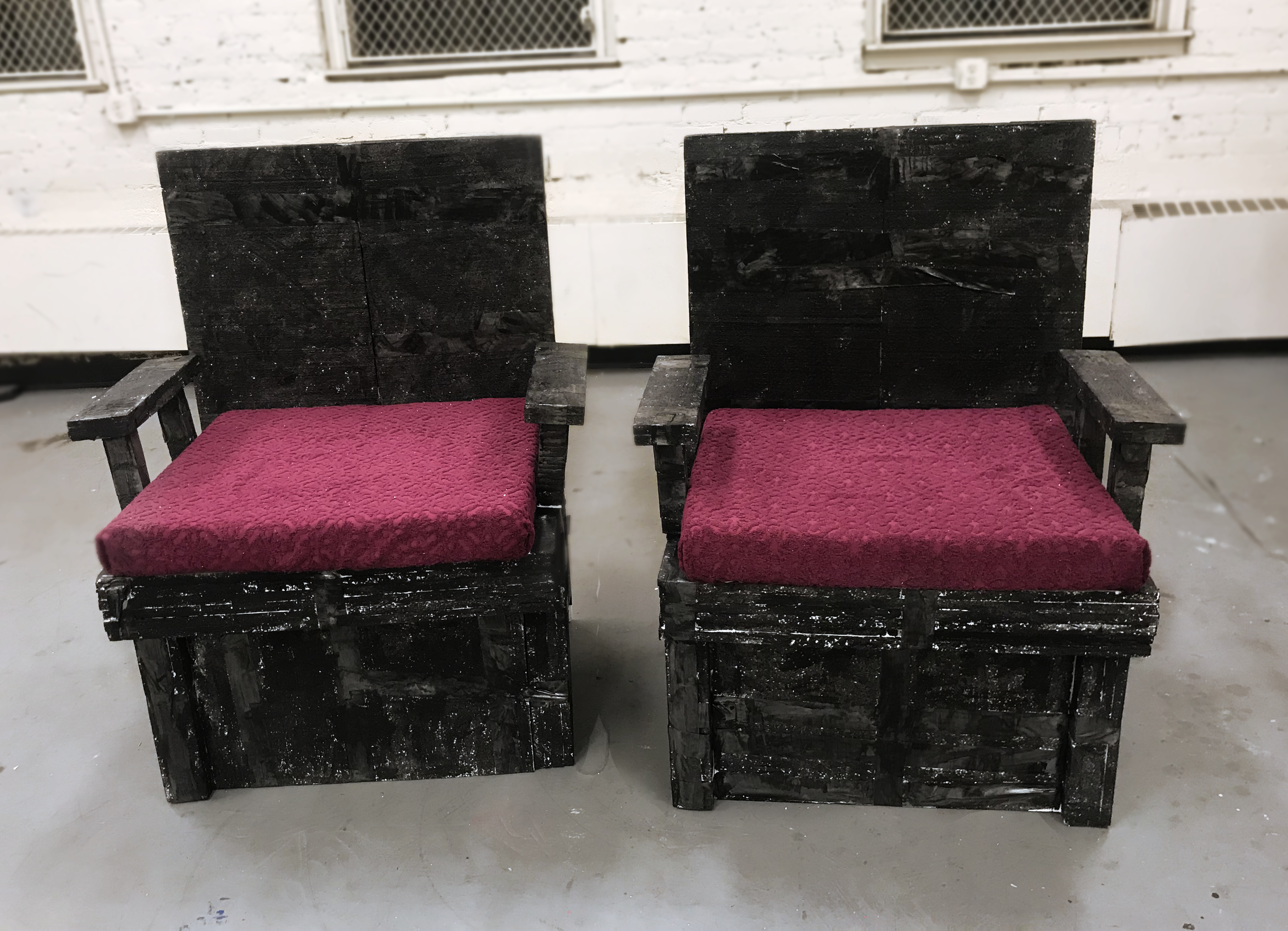
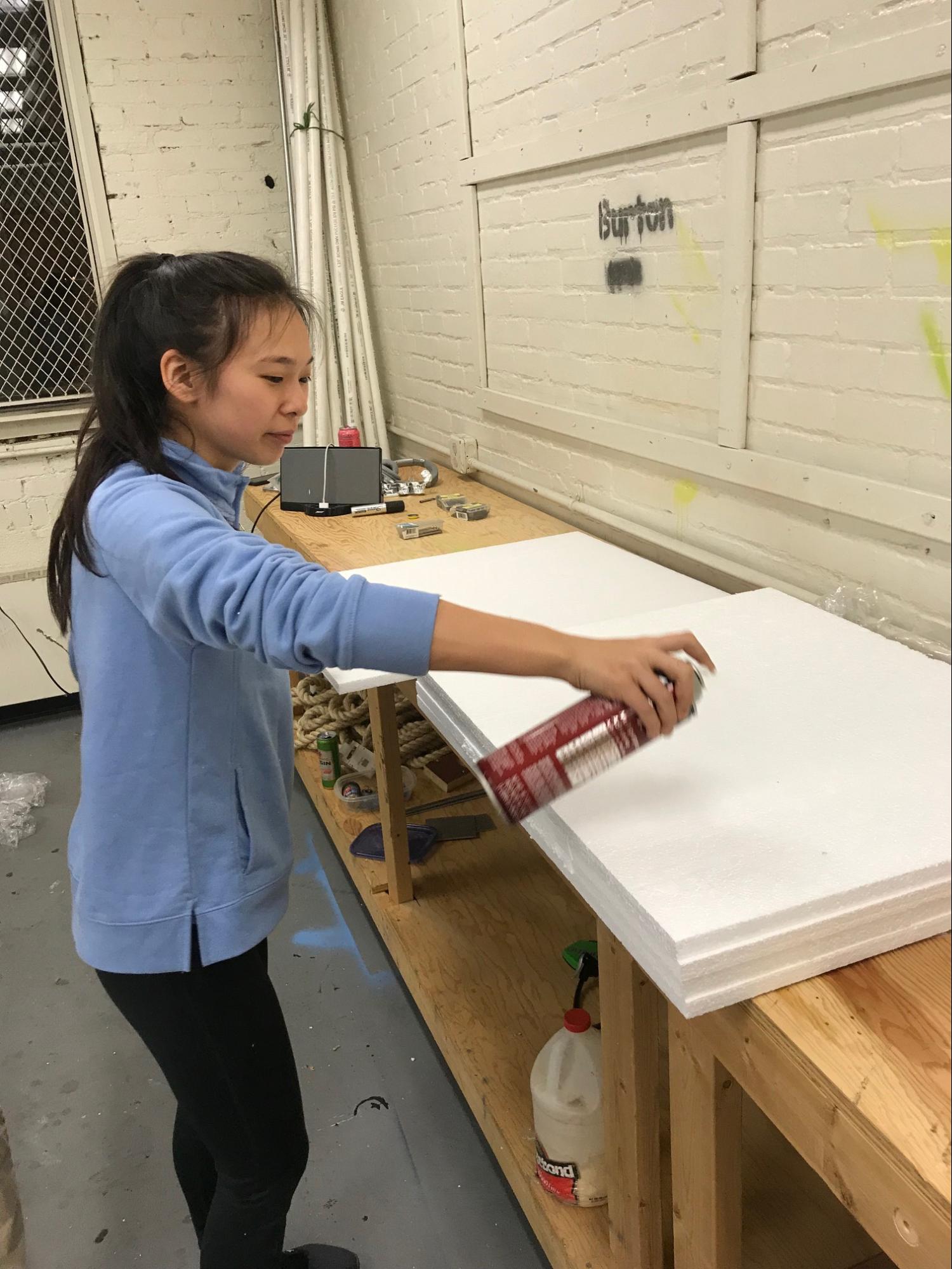
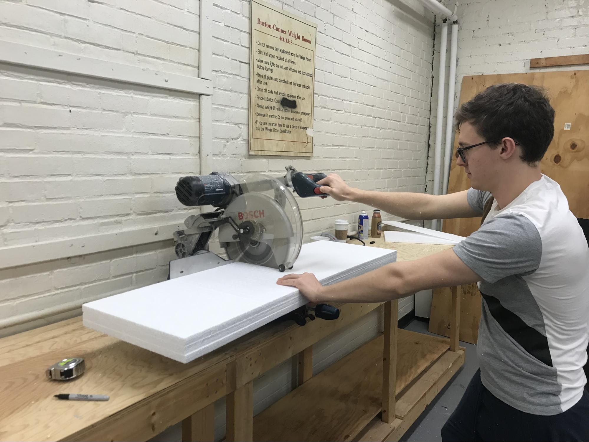
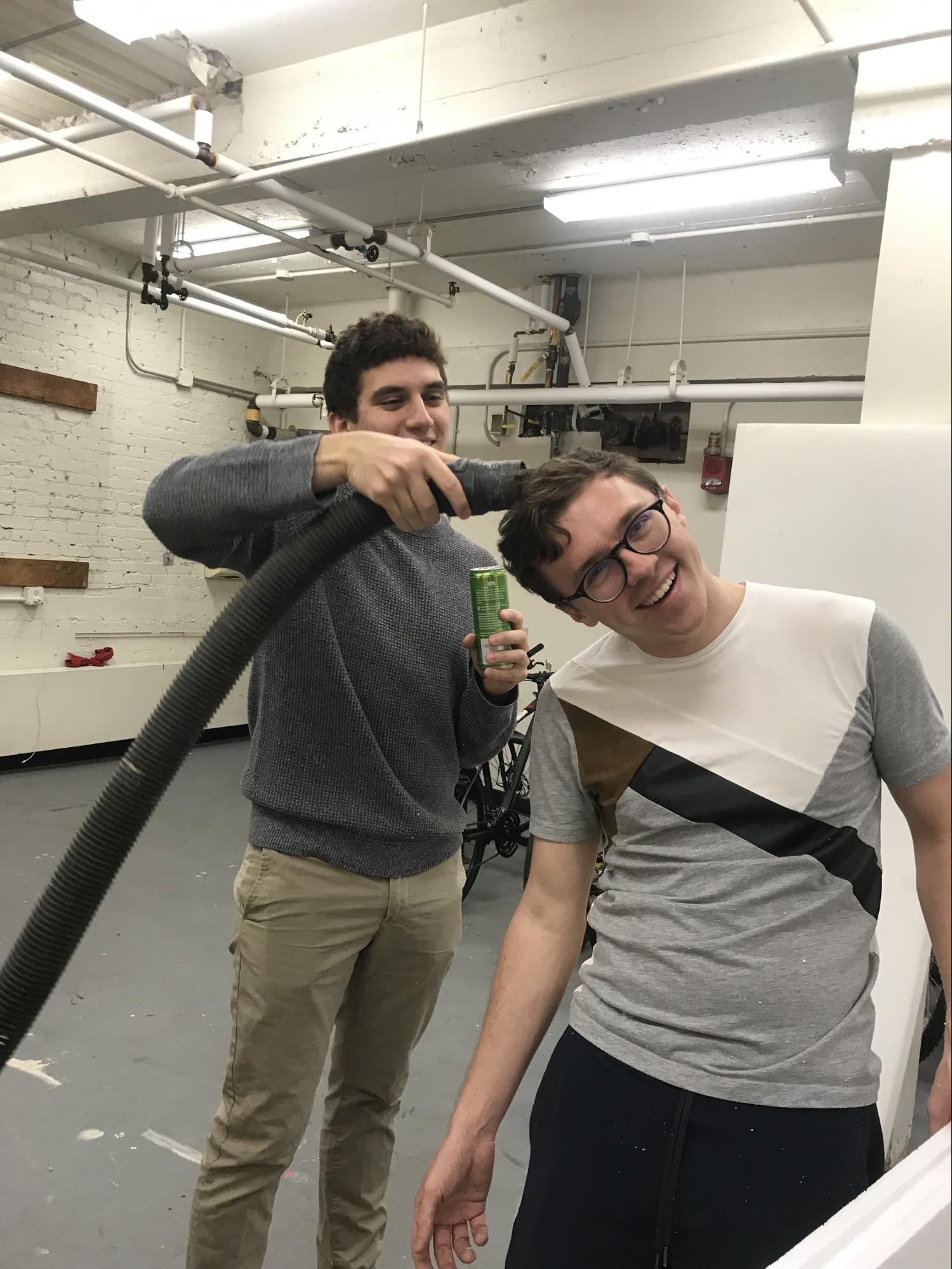
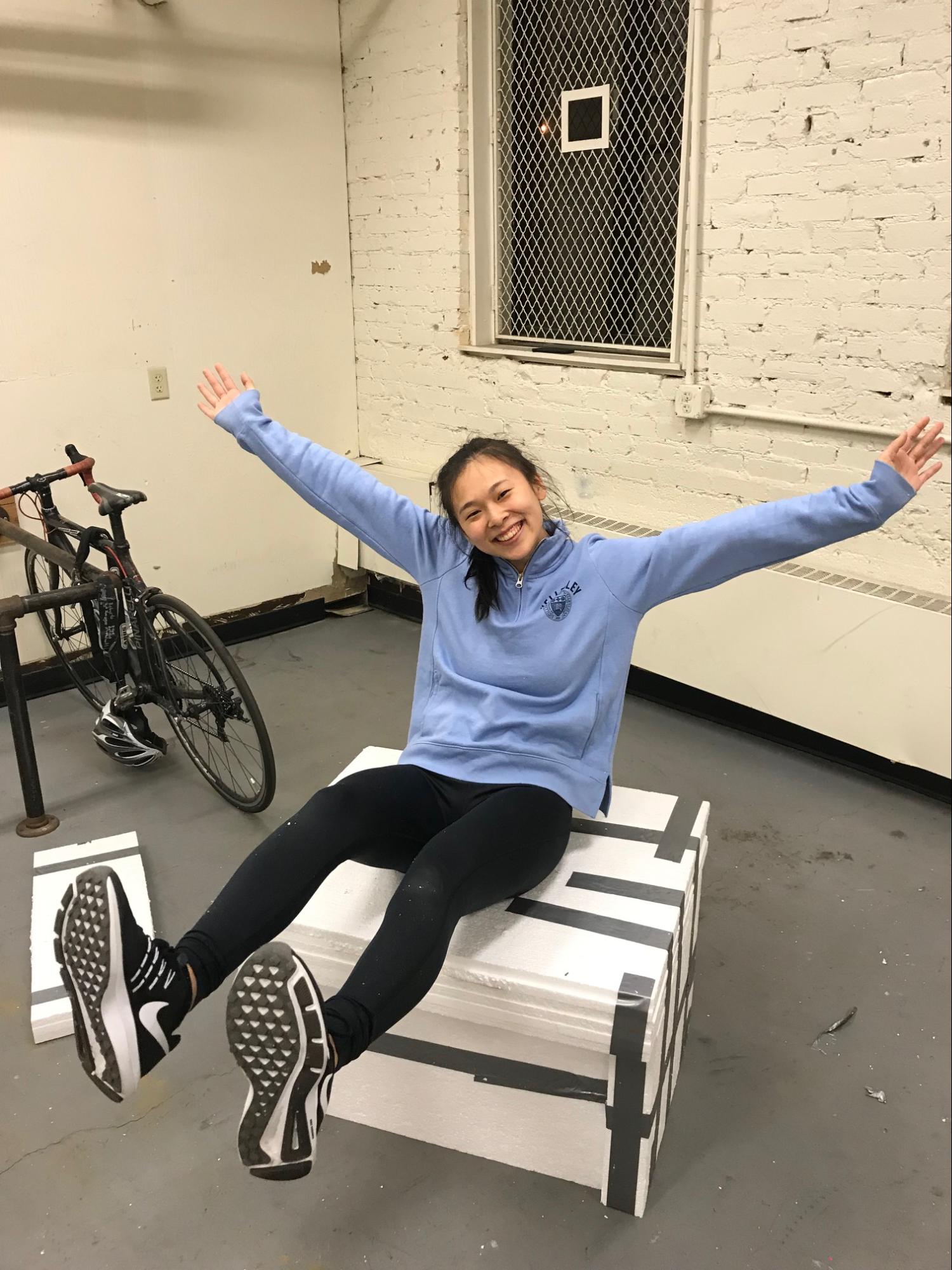
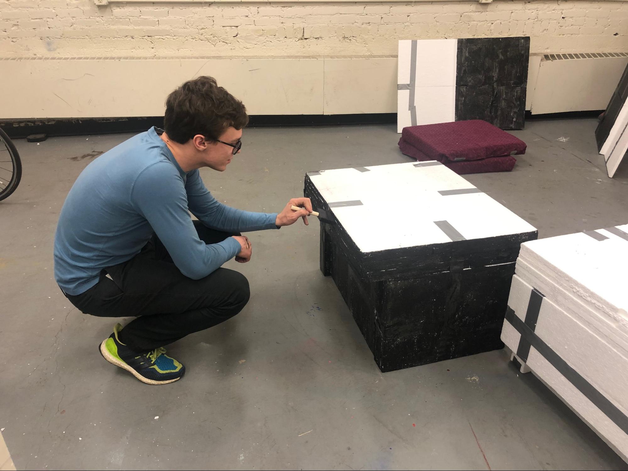
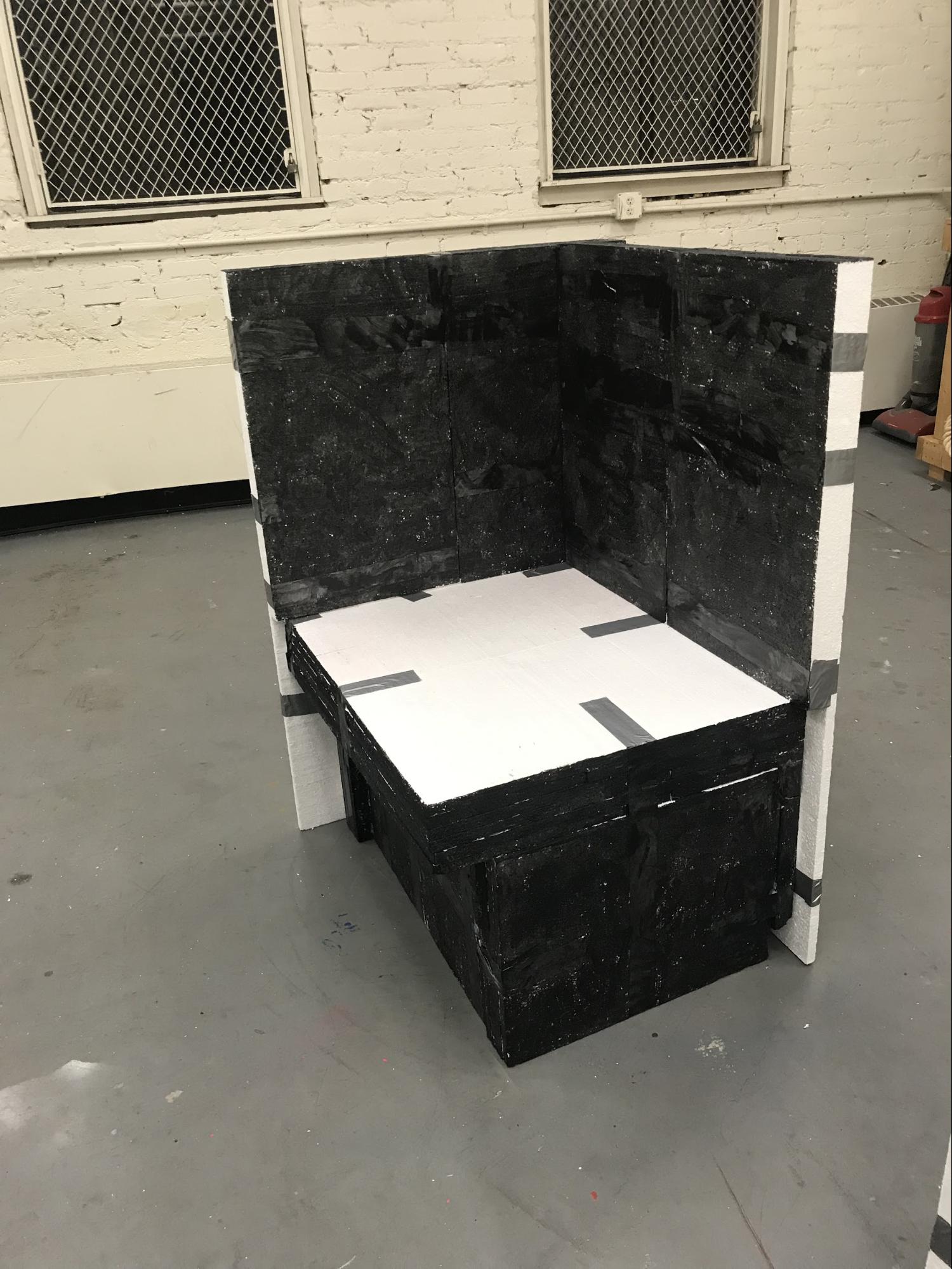
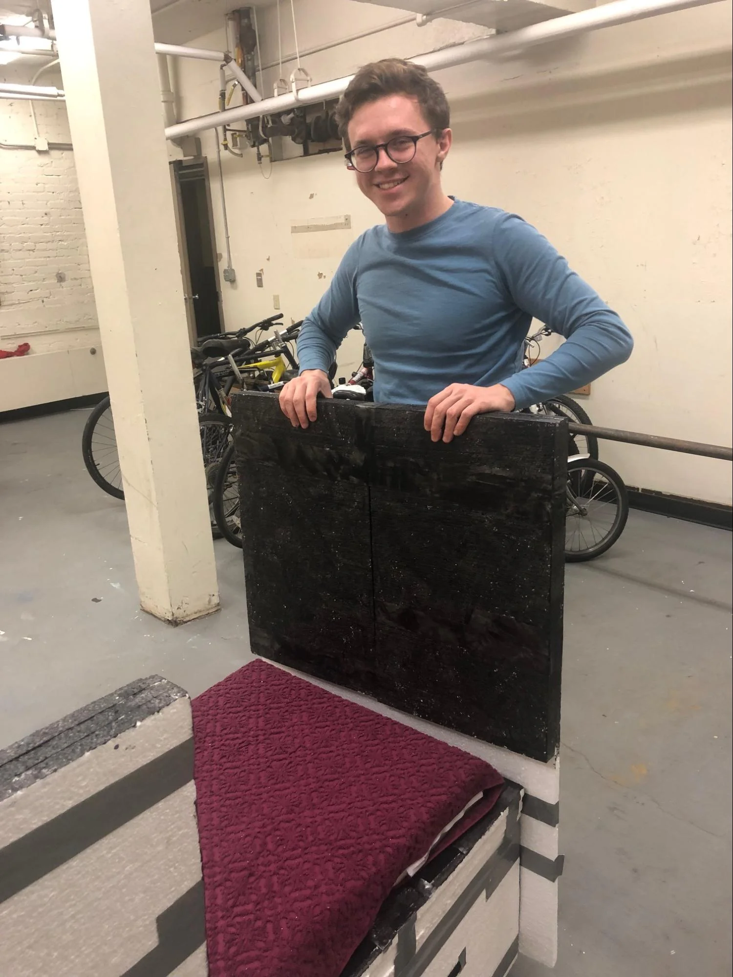
Having a physical prototype for our final design review was really important to us to communicate our concept properly - since the whole point was that it was very modular and configurable, the only way to get that across was to physically build them. We also had to build more than one, to show how different chair bases could connect together to create multiple variations for maximal comfort. And, of course, these chairs had to support weight, so our judges didn’t fall through them when they sat down.
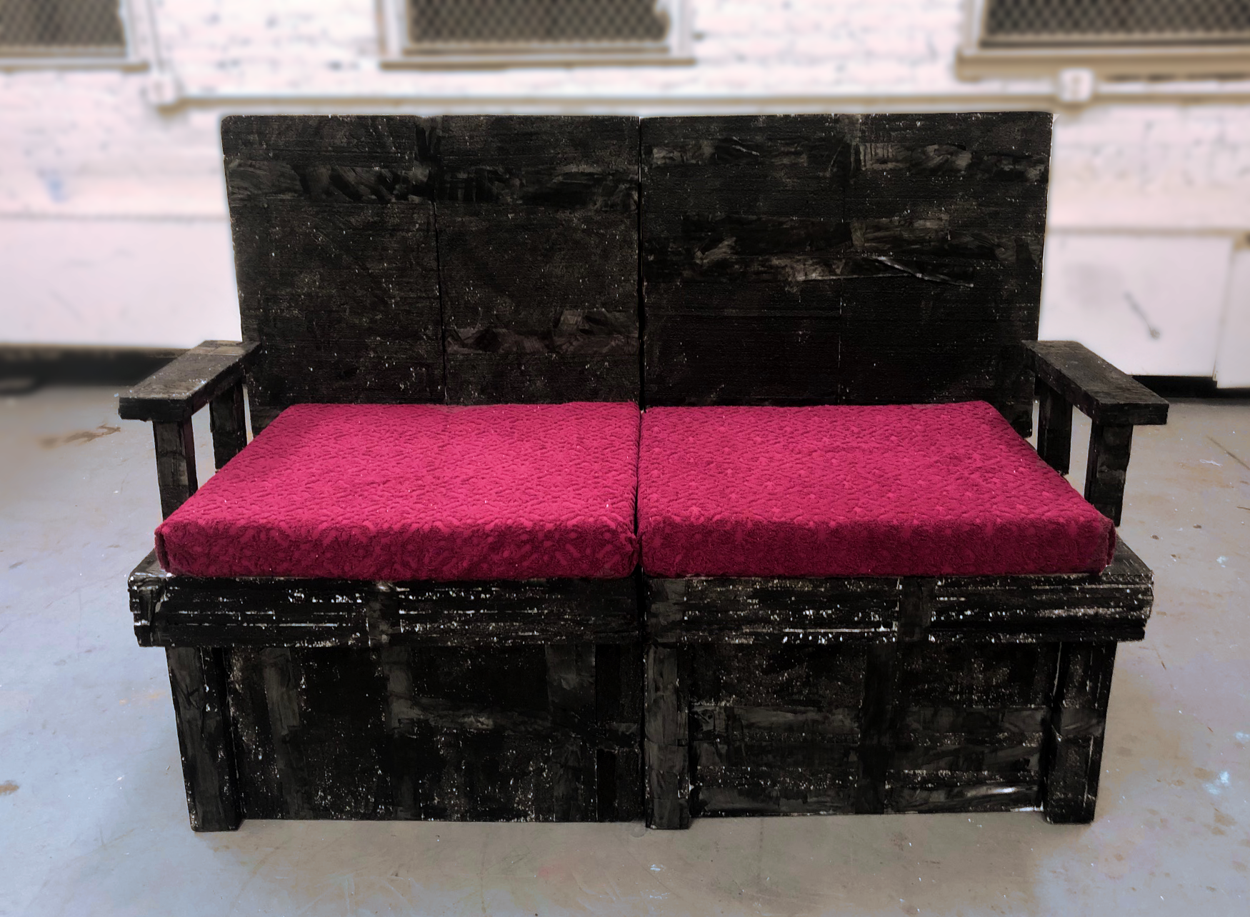
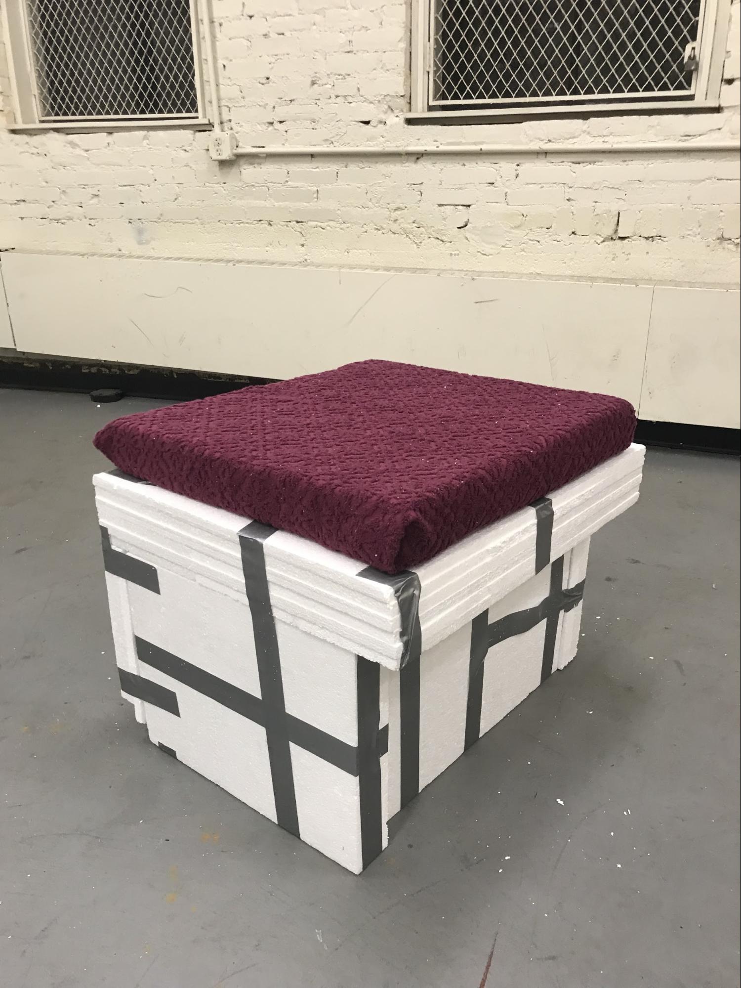
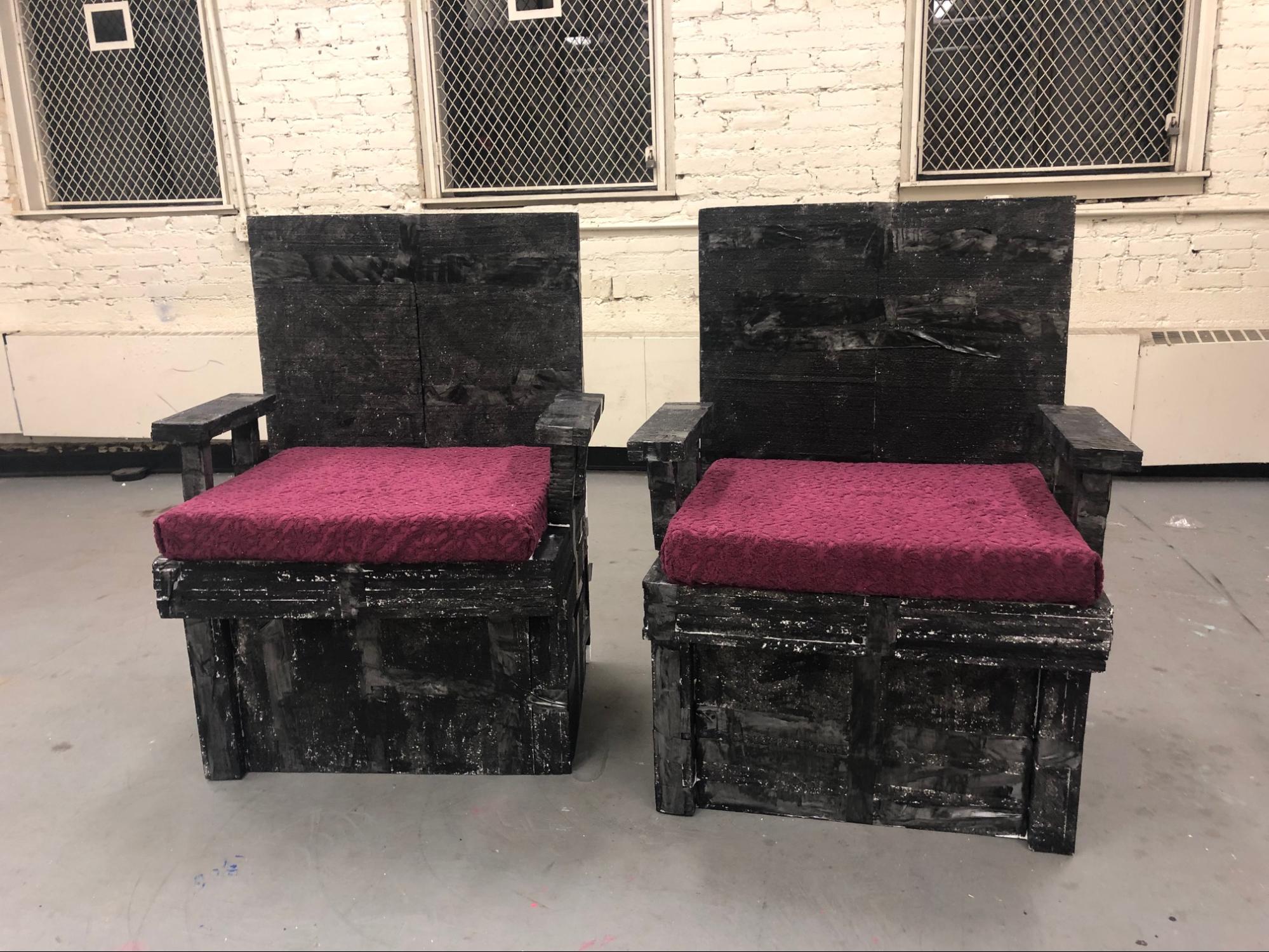
To do so, Kevin and I used sheets of styrofoam to create the chair base, back, and arms, while a sheet of thick foam upholstered with a towel was included to give it that luxury cushion. To make the parts easily detachable, we used velcro strips.
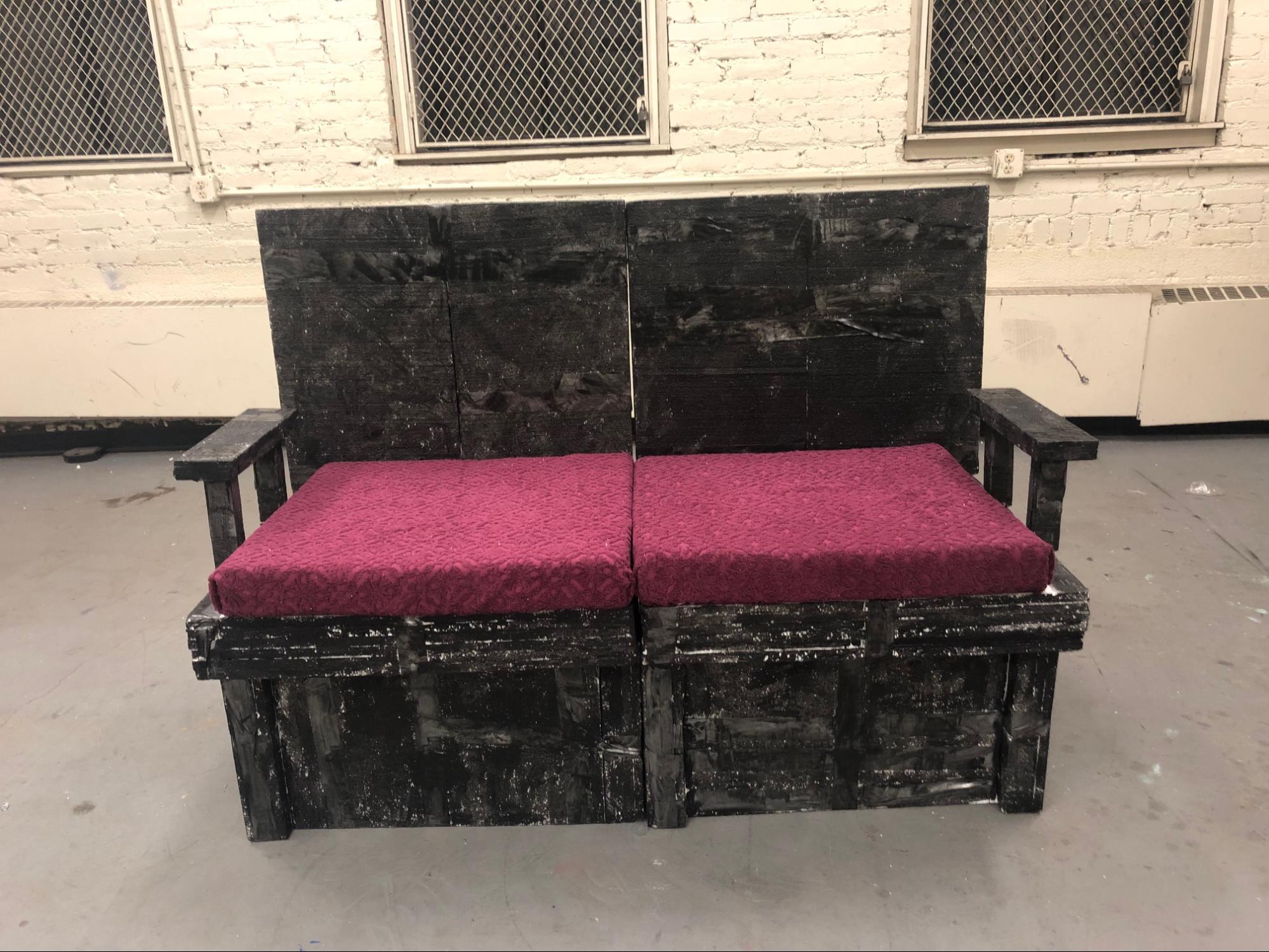
Finally, our result was two fully functional modular movie chairs. These could be stuck together in various ways, by removing and rearranging backs and arms, to create new kinds of seating and accomodate different comfort preferences within groups.
review and reflections
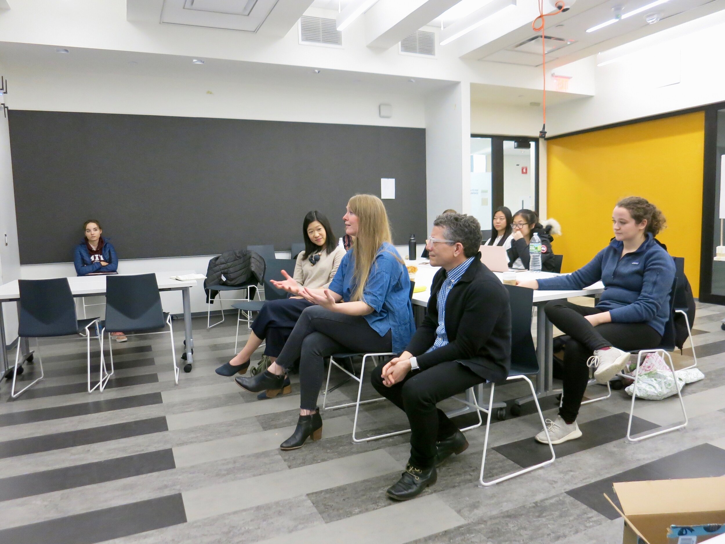
At the final review, Kevin and I presented our process to our classmates, our professor and a panel of professional designers, who also got to try out the chairs. They gave very positive feedback on the thoroughness of our process, how we clearly and effectively addressed issues present in the current movie theater experience, and our innovation and passion.
Overall, this project was an amazing opportunity to work at the intersection of business, tech, anthropology and design. I was also very excited to challenge myself by innovating within a physical space, something I had never done before, and thinking about how to redefine people’s expectations of an experience that they’re so used to. I really think that the movie theater is a dying industry, and one that really needs a boost from human-centered design.


